
⇐ Previous topic|Next topic ⇒
Table of Contents
Guide to fairly good graphs
Summary
It's not easy, but you can force spreadsheets to make publication-quality scientific graphs. This page explains how.
Introduction
Drawing graphs is an important part of analyzing your data and presenting the results of your research. Here I describe the features of clear, effective graphs, and I outline techniques for generating graphs using Excel. Most of these instructions also apply if you're using Calc, part of the free OpenOffice.org suite of programs, instead of Excel.
Many of the default conditions for Excel graphs are annoying, but with a little work, you can get it to produce graphs that are good enough for presentations and web pages. With a little more work, you can make publication-quality graphs. If you're drawing a lot of graphs, you may find it easier to use a specialized scientific graphing program.
General tips for all graphs
- Don't clutter up your graph with unnecessary junk. Grid lines, background patterns, 3-D effects, unnecessary legends, excessive tick marks, etc. all distract from the message of your graph.
- Do include all necessary information. Clearly label both axes of your graph, including measurement units if appropriate. You should identify symbols and patterns in a legend on the graph, or in the caption. If the graph has "error bars," you should say in the caption whether they're 95% confidence interval, standard error, standard deviation, comparison interval, or something else.
- Don't use color in graphs for publication. If your paper is a success, many people will be reading photocopies or will print it on a black-and-white printer. If the caption of a graph says "Red bars are mean HDL levels for patients taking 2000 mg niacin/day, while blue bars are patients taking the placebo," some of your readers will just see gray bars and will be confused and angry. For bars, use solid black, empty, gray, cross-hatching, vertical stripes, horizontal stripes, etc. Don't use different shades of gray, they may be hard to distinguish in photocopies. There are enough different symbols that you shouldn't need to use colors.
- Do use color in graphs for presentations. It's pretty, and it makes it easier to distinguish different categories of bars or symbols. But don't use red type on a blue background (or vice-versa), as the eye has a hard time focusing on both colors at once and it creates a distracting 3-D effect. And don't use both red and green bars or symbols on the same graph; from 5 to 10% of the men in your audience (and less than 1% of the women) have red-green colorblindness and can't distinguish red from green.
Choosing the right kind of graph
There are many kinds of graphs—bubble graphs, pie graphs, doughnut graphs, radar graphs—and each may be the best for some kinds of data. But by far the most common graphs in scientific publications are scatter graphs and bar graphs, so that's all that I'll talk about here.
Use a scatter graph (also known as an X-Y graph) for graphing data sets consisting of pairs of numbers. These could be measurement variables, or they could be nominal variables summarized as percentages. Plot the independent variable on the X axis (the horizontal axis), and plot the dependent variable on the Y axis.
The independent variable is the one that you manipulate, and the dependent variable is the one that you observe. For example, you might manipulate salt content in the diet and observe the effect this has on blood pressure. Sometimes you don't really manipulate either variable, you observe them both. In that case, if you are testing the hypothesis that changes in one variable cause changes in the other, put the variable that you think causes the changes on the X axis. For example, you might plot "height, in cm" on the X axis and "number of head-bumps per week" on the Y axis if you are investigating whether being tall causes people to bump their heads more often. Finally, there are times when there is no cause-and-effect relationship, in which case you can plot either variable on the X axis; an example would be a graph showing the correlation between arm length and leg length.
There are a few situations where it is common to put the independent variable on the Y axis. For example, oceanographers often put "distance below the surface of the ocean" on the Y axis, with the top of the ocean at the top of the graph, and the dependent variable (such as chlorophyll concentration, salinity, fish abundance, etc.) on the X axis. Don't do this unless you're really sure that it's a strong tradition in your field.
Use a bar graph for plotting means or percentages for different values of a nominal variable, such as mean blood pressure for people on four different diets. Usually, the mean or percentage is on the Y axis, and the different values of the nominal variable are on the X axis, yielding vertical bars.
In general, I recommend using a bar graph when the variable on the X axis is nominal, and a scatter graph when the variable on the X axis is measurement. Sometimes it is not clear whether the variable on the X axis is a measurement or nominal variable, and thus whether the graph should be a scatter graph or a bar graph. This is most common with measurements taken at different times. In this case, I think a good rule is that if you could have had additional data points in between the values on your X axis, then you should use a scatter graph; if you couldn't have additional data points, a bar graph is appropriate. For example, if you sample the pollen content of the air on January 15, February 15, March 15, etc., you should use a scatter graph, with "day of the year" on the X axis. Each point represents the pollen content on a single day, and you could have sampled on other days; there could be points in between January 15 and February 15. However, if you sampled the pollen every day of the year and then calculated the mean pollen content for each month, you should plot a bar graph, with a separate bar for each month. This is because you have one mean for January, and one mean for February, and of course there are no months between January and February. This is just a recommendation on my part; if most people in your field plot this kind of data with a scatter graph, you probably should too.
Drawing scatter graphs with Excel
- Put your independent variable in one column, with the dependent variable in the column to its right. You can have more than one dependent variable, each in its own column; each will be plotted with a different symbol.
- If you are plotting 95% confidence intervals, standard errors, standard deviation, or some other kind of error bar, put the values in the next column. These should be intervals, not limits; thus if your first data point has an X value of 7 and a Y value of 4 ±1.5, you'd have 7 in the first column, 4 in the second column, and 1.5 in the third column. For limits that are asymmetrical, such as the confidence limits on a binomial percentage, you'll need two columns, one for the difference between the percentage and the lower confidence limit, and one for the difference between the percentage and the upper confidence limit.
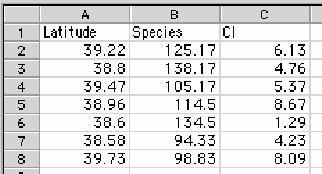
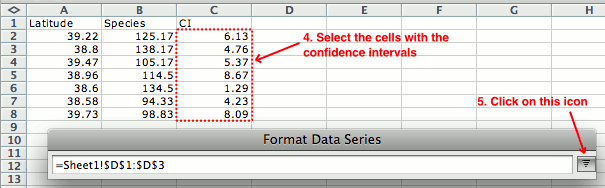
An Excel spreadsheet set up for a scatter graph. Latitude is the X variable, Species is the Y variable, and CI is the confidence intervals. - Select the cells that have the data in them. Don't select the cells that contain the confidence intervals. In the above example, you'd select cells A2 through B8.
- From the Insert menu, choose "Chart". Choose "Scatter" (called "X Y" in some versions of Excel) as your chart type, then "Marked Scatter" (the one with just dots, not lines) as your chart subtype. Do not choose "Line"; the little picture may look like a scatter graph, but it isn't. And don't choose the other types of scatter graphs, even if you're going to put lines on your graph; you'll add the lines to your "Marked Scatter" graph later.
- As you can see, the default graph looks horrible, so you need to fix it by formatting the various parts of the graph. Depending on which version of Excel you're using, you may need to click on the "Chart Layout" tab, or choose "Formatting Palette" from the View menu. If you don't see those, you can usually click once on the part of the graph you want to format, then choose it from the Format menu.
- You can enter a "Chart Title", which you will need for a presentation graph. You probably won't want a title for a publication graph (since the graph will have a detailed caption there). Then enter titles for the X axis and Y axis, and be sure to include the units. By clicking on an axis title and then choosing "Axis Title..." from the Format menu, you can format the font and other aspects of the titles.
- Use the "Legend" tab to get rid of the legend if you only have one set of Y values. If you have more than one set of Y values, get rid of the legend if you're going to explain the different symbols in the figure caption; leave the legend on if you think that's the most effective way to explain the symbols.
- Click on the "Axes" tab, choose the Y axis, and choose "Axis options". Modify the "Scale" (the minimum and maximum values of the Y axis). The maximum should be a nice round number, somewhat larger than the highest point on the graph. If you're plotting a binomial percentage, don't make the Y scale greater than 100%. If you're going to be adding error bars, the maximum Y should be high enough to include them. The minimum value on the Y scale should usually be zero, unless your observed values vary over a fairly narrow range. A good rule of thumb (that I made up, so don't take it too seriously) is that if your maximum observed Y is more than twice as large as your minimum observed Y, your Y scale should go down to zero. If you're plotting multiple graphs of similar data, they should all have the same scales for easier comparison.
- Also use the "Axes" tab to format the "Number" (the format for the numbers on the Y axis), "Ticks" (the position of tick marks, and whether you want "minor" tick marks in between the "major" ones). Use "Font" to set the font of the labels. Most publications recommend sans-serif fonts (such as Arial, Geneva, or Helvetica) for figures, and you should use the same font for axis labels, titles, and any other text on your graph.
- Format your X axis the same way you formatted your Y axis.
- Use the "Gridlines" tab get rid of the gridlines; they're ugly and unnecessary.
- If you want to add a regression line to your graph, click on one of the symbols, then choose "Add Trendline..." from the Chart menu. You will almost always want the linear trendline. Only add a regression line if it conveys useful information about your data; don't just automatically add one as decoration to all scatter graphs.
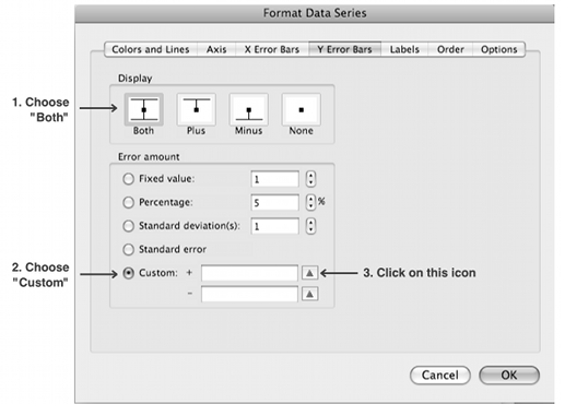
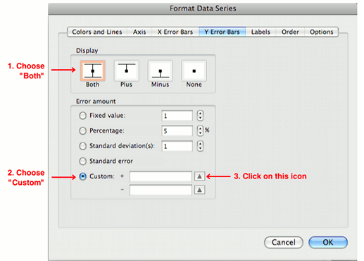
- If you want to add error bars, ignore the "Error Bars" tab; instead, click on one of the symbols on the graph, and choose "Data Series" from the Format menu. Click on "Error Bars" on the left side, and then choose "Y Error Bars". Ignore "Error Bars with Standard Error" and "Error Bars with Standard Deviation", because they are not what they sound like; click on "Custom" instead. Click on the "Specify value" button and click on the little picture to the right of the "Positive Error Value". Then drag to select the range of cells that contains your positive error intervals. In the above example, you would select cells C2 to C8. Click on the picture next to the box, and use the same procedure to select the cells containing your negative error intervals (which will be the same range of cells as the positive intervals, unless your error bars are asymmetrical). If you want horizontal (X axis) error bars as well, repeat this procedure.
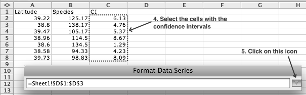
Adding error bars to a graph. Repeat steps 3, 4 and 5 for the box labeled "-". - To format the symbols, click on one, and choose "Data Series" from the Format menu. Use "Marker Style" to set the shape of the markers, "Marker Line" to set the color and thickness of the line around the symbols, and "Marker Fill" to set the color that fills the marker. Repeat this for each set of symbols.
- Click in the graph area, inside the graph, to select the whole graph. Choose "Plot Area" from the Format menu. Choose "Line" and set the color to black, to draw a black line on all four sides of the graph.
- Click in the graph area, outside the graph, to select the whole box that includes the graph and the labels. Choose "Chart Area" from the Format menu. Choose "Line" and set the color to "No Line". On the "Properties" tab, choose "Don't move or size with cells," so the graph won't change size if you adjust the column widths of the spreadsheet.
- You should now have a beautiful, beautiful graph. You can click once on the graph area (in the blank area outside the actual graph), copy it, and paste it into a word processing document, graphics program or presentation.
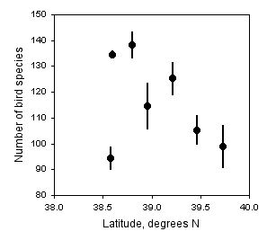
The number of bird species observed in the Christmas Bird Count vs. latitude at seven locations in Delaware. Data points are the mean number of species for the counts in 2001 through 2006, with 95% confidence intervals.

Drawing bar graphs with Excel
- Put the values of the independent variable (the nominal variable) in one column, with the dependent variable in the column to its right. The first column will be used to label the bars or clusters of bars. You can have more than one dependent variable, each in its own column; each will be plotted with a different pattern of bar.
- If you are plotting 95% confidence intervals or some other kind of error bar, put the values in the next column. These should be confidence intervals, not confidence limits; thus if your first row has a Y value of 4 ±1.5, you'd have Control in the first column, 4 in the second column, and 1.5 in the third column. For confidence limits that are asymmetrical, such as the confidence intervals on a binomial percentage, you'll need two columns, one for the lower confidence interval, and one for the upper confidence interval.
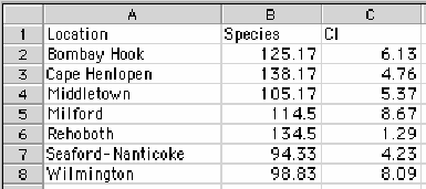
An Excel spreadsheet set up for a bar graph including confidence intervals. - Select the cells that have the data in them. Include the first column, with the values of the nominal variable, but don't select cells that contain confidence intervals.
- From the Insert menu, choose "Chart". Choose "Column" as your chart type, and then "Clustered Column" under "2-D Column." Do not choose the three-dimensional bars, as they just add a bunch of clutter to your graph without conveying any additional information.
- The default graph looks horrible, so you need to fix it by formatting the various parts of the graph. Depending on which version of Excel you're using, you may need to click on the "Chart Layout" tab, or choose "Formatting Palette" from the View menu. If you don't see those, you can usually click once on the part of the graph you want to format, then choose it from the Format menu.
- You can enter a "Chart Title", which you will need for a presentation, but probably not for a publication (since the graph will have a detailed caption there). Then enter a title for the Y axis, including the units. You may or may not need an X axis title, depending on how self-explanatory the column labels are. By clicking on "Axis title options..." you can format the font and other aspects of the titles.
- Use the "Legend" tab to get rid of the legend if you only have one set of bars. If you have more than one set of bars, get rid of the legend if you're going to explain the different patterns in the figure caption; leave the legend on if you think that's the most effective way to explain the bar patterns.
- Click on the "Axes" tab, choose the Y axis, and choose "Axis options". Modify the "Scale" (the minimum and maximum values of the Y axis). The maximum should be a nice round number, somewhat larger than the highest point on the graph. If you're plotting a binomial percentage, don't make the Y scale greater than 100%. If you're going to be adding error bars, the maximum Y should be high enough to include them. The minimum value on the Y scale should usually be zero, unless your observed values vary over a fairly narrow range. A good rule of thumb (that I made up, so don't take it too seriously) is that if your maximum observed Y is more than twice as large as your minimum observed Y, your Y scale should go down to zero. If you're plotting multiple graphs of similar data, they should all have the same scales for easier comparison.
- Also use the "Axes" tab to format the "Number" (the format for the numbers on the Y axis), Ticks (the position of tick marks, and whether you want "minor" tick marks in between the "major" ones). Use "Font" to set the font of the labels. Most publications recommend sans-serif fonts (such as Arial, Geneva, or Helvetica) for figures, and you should use the same font for axis labels, titles, and any other text on your graph.
- Format your X axis the same way you formatted your Y axis.
- Use the "Gridlines" tab get rid of the gridlines; they're ugly and unnecessary.
- If you want to add error bars, ignore the "Error Bars" tab; instead, click on one of the bars on the graph, and choose "Data Series" from the Format menu. Click on "Error Bars" on the left side. Ignore "Standard Error" and "Standard Deviation", because they are not what they sound like; click on "Custom" instead. Click on the "Specify value" button and click on the little picture to the right of the "Positive Error Value". Then drag to select the range of cells that contains your positive error intervals. In the above example, you would select cells C2 to C8. Click on the picture next to the box, and use the same procedure to select the cells containing your negative error intervals (which will be the same range of cells as the positive intervals, unless your error bars are asymmetrical).
- To format the bars, click on one, and choose "Data Series" from the "Format" menu. Use "Line" to set the color and thickness of the lines around the bars, and "Fill" to set the color and pattern that fills the bars. Repeat this for each set of bars. Use "Options" to adjust the "Gap width," the space between sets of bars, and "Overlap" to adjust the space between bars within a set. Negative values for "Overlap" will produce a gap between bars within the same group.
- Click in the graph area, inside the graph, to select the whole graph. Choose "Plot Area" from the Format menu. Choose "Line" and set the color to black, to draw a black line on all four sides of the graph.
- Click in the graph area, outside the graph, to select the whole box that includes the graph and the labels. Choose "Chart Area" from the Format menu. Choose "Line" and set the color to "No Line". On the "Properties" tab, choose "Don't move or size with cells," so the graph won't change size if you adjust the column widths of the spreadsheet.
- You should now have a beautiful, beautiful graph.
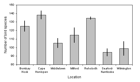
The number of bird species observed in the Christmas Bird Count at seven locations in Delaware. Data points are the mean number of species for the counts in 2001 through 2006, with 95% confidence intervals.
Exporting Excel graphs to other formats
Once you've produced a graph, you'll probably want to export it to another program. You may want to put the graph in a presentation (Powerpoint, Keynote, Impress, etc.) or a word processing document. This is easy; click in the graph area to select the whole thing, copy it, then paste it into your presentation or word processing document. Sometimes, this will be good enough quality for your purposes.
Sometimes, you'll want to put the graph in a graphics program, so you can refine the graphics in ways that aren't possible in Excel, or so you can export the graph as a separate graphics file. This is particularly important for publications, where you need each figure to be a separate graphics file in the format and high resolution demanded by the publisher. To do this, right-click on the graph area (control-click on a Mac) somewhere outside the graph, then choose "Save as Picture". Change the format to PDF and you will create a pdf file containing just your graph. You can then open the pdf in a vector graphics program such as Adobe Illustrator or the free program Inkscape, ungroup the different elements of the graph, modify it, and export it in whatever format you need.
⇐ Previous topic|Next topic ⇒
Table of Contents
This page was last revised December 4, 2014. Its address is http://www.biostathandbook.com/graph.html. It may be cited as:
McDonald, J.H. 2014. Handbook of Biological Statistics (3rd ed.). Sparky House Publishing, Baltimore, Maryland. This web page contains the content of pages 274-282 in the printed version.
©2014 by John H. McDonald. You can probably do what you want with this content; see the permissions page for details.