
⇐ Previous topic|Next topic ⇒
Table of Contents
Normality
Summary
Most tests for measurement variables assume that data are normally distributed (fit a bell-shaped curve). Here I explain how to check this and what to do if the data aren't normal.
Introduction
A probability distribution specifies the probability of getting an observation in a particular range of values; the normal distribution is the familiar bell-shaped curve, with a high probability of getting an observation near the middle and lower probabilities as you get further from the middle. A normal distribution can be completely described by just two numbers, or parameters, the mean and the standard deviation; all normal distributions with the same mean and same standard deviation will be exactly the same shape. One of the assumptions of an anova and other tests for measurement variables is that the data fit the normal probability distribution. Because these tests assume that the data can be described by two parameters, the mean and standard deviation, they are called parametric tests.
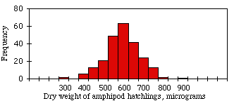
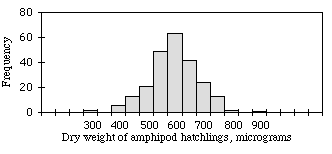
When you plot a frequency histogram of measurement data, the frequencies should approximate the bell-shaped normal distribution. For example, the figure shown at the right is a histogram of dry weights of newly hatched amphipods (Platorchestia platensis), data I tediously collected for my Ph.D. research. It fits the normal distribution pretty well.
Many biological variables fit the normal distribution quite well. This is a result of the central limit theorem, which says that when you take a large number of random numbers, the means of those numbers are approximately normally distributed. If you think of a variable like weight as resulting from the effects of a bunch of other variables averaged together—age, nutrition, disease exposure, the genotype of several genes, etc.—it's not surprising that it would be normally distributed.
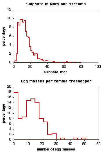
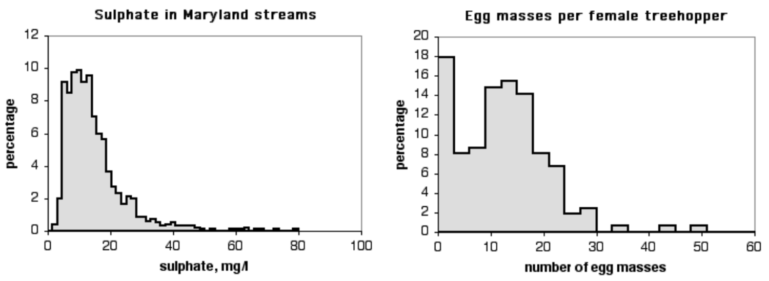
Other data sets don't fit the normal distribution very well. The histogram on the top is the level of sulphate in Maryland streams (data from the Maryland Biological Stream Survey). It doesn't fit the normal curve very well, because there are a small number of streams with very high levels of sulphate. The histogram on the bottom is the number of egg masses laid by indivuduals of the lentago host race of the treehopper Enchenopa (unpublished data courtesy of Michael Cast). The curve is bimodal, with one peak at around 14 egg masses and the other at zero.
Parametric tests assume that your data fit the normal distribution. If your measurement variable is not normally distributed, you may be increasing your chance of a false positive result if you analyze the data with a test that assumes normality.
What to do about non-normality
Once you have collected a set of measurement data, you should look at the frequency histogram to see if it looks non-normal. There are statistical tests of the goodness-of-fit of a data set to the normal distribution, but I don't recommend them, because many data sets that are significantly non-normal would be perfectly appropriate for an anova or other parametric test. Fortunately, an anova is not very sensitive to moderate deviations from normality; simulation studies, using a variety of non-normal distributions, have shown that the false positive rate is not affected very much by this violation of the assumption (Glass et al. 1972, Harwell et al. 1992, Lix et al. 1996). This is another result of the central limit theorem, which says that when you take a large number of random samples from a population, the means of those samples are approximately normally distributed even when the population is not normal.
Because parametric tests are not very sensitive to deviations from normality, I recommend that you don't worry about it unless your data appear very, very non-normal to you. This is a subjective judgement on your part, but there don't seem to be any objective rules on how much non-normality is too much for a parametric test. You should look at what other people in your field do; if everyone transforms the kind of data you're collecting, or uses a non-parametric test, you should consider doing what everyone else does even if the non-normality doesn't seem that bad to you.
If your histogram looks like a normal distribution that has been pushed to one side, like the sulphate data above, you should try different data transformations to see if any of them make the histogram look more normal. It's best if you collect some data, check the normality, and decide on a transformation before you run your actual experiment; you don't want cynical people to think that you tried different transformations until you found one that gave you a signficant result for your experiment.
If your data still look severely non-normal no matter what transformation you apply, it's probably still okay to analyze the data using a parametric test; they're just not that sensitive to non-normality. However, you may want to analyze your data using a non-parametric test. Just about every parametric statistical test has a non-parametric substitute, such as the Kruskal–Wallis test instead of a one-way anova, Wilcoxon signed-rank test instead of a paired t–test, and Spearman rank correlation instead of linear regression/correlation. These non-parametric tests do not assume that the data fit the normal distribution. They do assume that the data in different groups have the same distribution as each other, however; if different groups have different shaped distributions (for example, one is skewed to the left, another is skewed to the right), a non-parametric test will not be any better than a parametric one.
Skewness and kurtosis
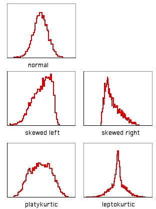
A histogram with a long tail on the right side, such as the sulphate data above, is said to be skewed to the right; a histogram with a long tail on the left side is said to be skewed to the left. There is a statistic to describe skewness, g1, but I don't know of any reason to calculate it; there is no rule of thumb that you shouldn't do a parametric test if g1 is greater than some cutoff value.
Another way in which data can deviate from the normal distribution is kurtosis. A histogram that has a high peak in the middle and long tails on either side is leptokurtic; a histogram with a broad, flat middle and short tails is platykurtic. The statistic to describe kurtosis is g2, but I can't think of any reason why you'd want to calculate it, either.
How to look at normality
Spreadsheet
I've written a spreadsheet that will plot a frequency histogram for untransformed, log-transformed and square-root transformed data. It will handle up to 1000 observations.
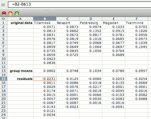
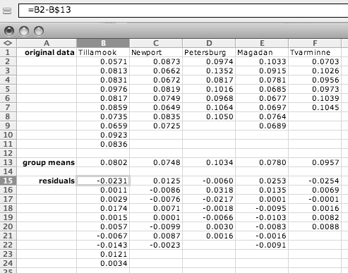
If there are not enough observations in each group to check normality, you may want to examine the residuals (each observation minus the mean of its group). To do this, open a separate spreadsheet and put the numbers from each group in a separate column. Then create columns with the mean of each group subtracted from each observation in its group, as shown below. Copy these numbers into the histogram spreadsheet.
Web pages
There are several web pages that will produce histograms, but most of them aren't very good; this histogram calculator is the best I've found.
SAS
You can use the PLOTS option in PROC UNIVARIATE to get a stem-and-leaf display, which is a kind of very crude histogram. You can also use the HISTOGRAM option to get an actual histogram, but only if you know how to send the output to a graphics device driver.
References
Glass, G.V., P.D. Peckham, and J.R. Sanders. 1972. Consequences of failure to meet assumptions underlying fixed effects analyses of variance and covariance. Review of Educational Research 42: 237-288.
Harwell, M.R., E.N. Rubinstein, W.S. Hayes, and C.C. Olds. 1992. Summarizing Monte Carlo results in methodological research: the one- and two-factor fixed effects ANOVA cases. Journal of Educational Statistics 17: 315-339.
Lix, L.M., J.C. Keselman, and H.J. Keselman. 1996. Consequences of assumption violations revisited: A quantitative review of alternatives to the one-way analysis of variance F test. Review of Educational Research 66: 579-619.
⇐ Previous topic|Next topic ⇒
Table of Contents
This page was last revised December 4, 2014. Its address is http://www.biostathandbook.com/normality.html. It may be cited as:
McDonald, J.H. 2014. Handbook of Biological Statistics (3rd ed.). Sparky House Publishing, Baltimore, Maryland. This web page contains the content of pages 133-136 in the printed version.
©2014 by John H. McDonald. You can probably do what you want with this content; see the permissions page for details.