
⇐ Previous topic|Next topic
⇒
Table of Contents
Correlation and linear regression
Summary
Use linear regression or correlation when you want to know whether one measurement variable is associated with another measurement variable; you want to measure the strength of the association (r2); or you want an equation that describes the relationship and can be used to predict unknown values.
Introduction
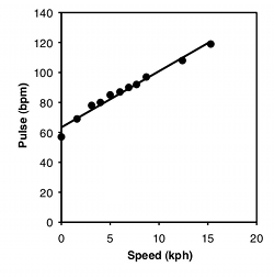
One of the most common graphs in science plots one measurement variable on the x (horizontal) axis vs. another on the y (vertical) axis. For example, here are two graphs. For the first, I dusted off the elliptical machine in our basement and measured my pulse after one minute of ellipticizing at various speeds:
| Speed, kph | Pulse, bpm |
|---|---|
| 0 | 57 |
| 1.6 | 69 |
| 3.1 | 78 |
| 4 | 80 |
| 5 | 85 |
| 6 | 87 |
| 6.9 | 90 |
| 7.7 | 92 |
| 8.7 | 97 |
| 12.4 | 108 |
| 15.3 | 119 |
For the second graph, I dusted off some data from McDonald (1989): I collected the amphipod crustacean Platorchestia platensis on a beach near Stony Brook, Long Island, in April, 1987, removed and counted the number of eggs each female was carrying, then freeze-dried and weighed the mothers:
| Weight, mg | Eggs |
|---|---|
| 5.38 | 29 |
| 7.36 | 23 |
| 6.13 | 22 |
| 4.75 | 20 |
| 8.10 | 25 |
| 8.62 | 25 |
| 6.30 | 17 |
| 7.44 | 24 |
| 7.26 | 20 |
| 7.17 | 27 |
| 7.78 | 24 |
| 6.23 | 21 |
| 5.42 | 22 |
| 7.87 | 22 |
| 5.25 | 23 |
| 7.37 | 35 |
| 8.01 | 27 |
| 4.92 | 23 |
| 7.03 | 25 |
| 6.45 | 24 |
| 5.06 | 19 |
| 6.72 | 21 |
| 7.00 | 20 |
| 9.39 | 33 |
| 6.49 | 17 |
| 6.34 | 21 |
| 6.16 | 25 |
| 5.74 | 22 |
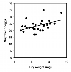
There are three things you can do with this kind of data. One is a hypothesis test, to see if there is an association between the two variables; in other words, as the X variable goes up, does the Y variable tend to change (up or down). For the exercise data, you'd want to know whether pulse rate was significantly higher with higher speeds. The P value is 1.3×10⁻⁸, but the relationship is so obvious from the graph, and so biologically unsurprising (of course my pulse rate goes up when I exercise harder!), that the hypothesis test wouldn't be a very interesting part of the analysis. For the amphipod data, you'd want to know whether bigger females had more eggs or fewer eggs than smaller amphipods, which is neither biologically obvious nor obvious from the graph. It may look like a random scatter of points, but there is a significant relationship (P=0.015).
The second goal is to describe how tightly the two variables are associated. This is usually expressed with r, which ranges from −1 to 1, or r2, which ranges from 0 to 1. For the exercise data, there's a very tight relationship, as shown by the r2 of 0.98; this means that if you knew my speed on the elliptical machine, you'd be able to predict my pulse quite accurately. The r2 for the amphipod data is a lot lower, at 0.21; this means that even though there's a significant relationship between female weight and number of eggs, knowing the weight of a female wouldn't let you predict the number of eggs she had with very much accuracy.
The final goal is to determine the equation of a line that goes through the cloud of points. The equation of a line is given in the form Ŷ=a+bX, where Ŷ is the value of Y predicted for a given value of X, a is the Y intercept (the value of Y when X is zero), and b is the slope of the line (the change in Ŷ for a change in X of one unit). For the exercise data, the equation is Ŷ=63.5+3.75X; this predicts that my pulse would be 63.5 when the speed of the elliptical machine is 0 kph, and my pulse would go up by 3.75 beats per minute for every 1 kph increase in speed. This is probably the most useful part of the analysis for the exercise data; if I wanted to exercise with a particular level of effort, as measured by pulse rate, I could use the equation to predict the speed I should use. For the amphipod data, the equation is Ŷ=12.7+1.60X. For most purposes, just knowing that bigger amphipods have significantly more eggs (the hypothesis test) would be more interesting than knowing the equation of the line, but it depends on the goals of your experiment.
When to use them
Use correlation/linear regression when you have two measurement variables, such as food intake and weight, drug dosage and blood pressure, air temperature and metabolic rate, etc.
There's also one nominal variable that keeps the two measurements together in pairs, such as the name of an individual organism, experimental trial, or location. I'm not aware that anyone else considers this nominal variable to be part of correlation and regression, and it's not something you need to know the value of—you could indicate that a food intake measurement and weight measurement came from the same rat by putting both numbers on the same line, without ever giving the rat a name. For that reason, I'll call it a "hidden" nominal variable.
The main value of the hidden nominal variable is that it lets me make the blanket statement that any time you have two or more measurements from a single individual (organism, experimental trial, location, etc.), the identity of that individual is a nominal variable; if you only have one measurement from an individual, the individual is not a nominal variable. I think this rule helps clarify the difference between one-way, two-way, and nested anova. If the idea of hidden nominal variables in regression confuses you, you can ignore it.
There are three main goals for correlation and regression in biology. One is to see whether two measurement variables are associated with each other; whether as one variable increases, the other tends to increase (or decrease). You summarize this test of association with the P value. In some cases, this addresses a biological question about cause-and-effect relationships; a significant association means that different values of the independent variable cause different values of the dependent. An example would be giving people different amounts of a drug and measuring their blood pressure. The null hypothesis would be that there was no relationship between the amount of drug and the blood pressure. If you reject the null hypothesis, you would conclude that the amount of drug causes the changes in blood pressure. In this kind of experiment, you determine the values of the independent variable; for example, you decide what dose of the drug each person gets. The exercise and pulse data are an example of this, as I determined the speed on the elliptical machine, then measured the effect on pulse rate.
In other cases, you want to know whether two variables are associated, without necessarily inferring a cause-and-effect relationship. In this case, you don't determine either variable ahead of time; both are naturally variable and you measure both of them. If you find an association, you infer that variation in X may cause variation in Y, or variation in Y may cause variation in X, or variation in some other factor may affect both Y and X. An example would be measuring the amount of a particular protein on the surface of some cells and the pH of the cytoplasm of those cells. If the protein amount and pH are correlated, it may be that the amount of protein affects the internal pH; or the internal pH affects the amount of protein; or some other factor, such as oxygen concentration, affects both protein concentration and pH. Often, a significant correlation suggests further experiments to test for a cause and effect relationship; if protein concentration and pH were correlated, you might want to manipulate protein concentration and see what happens to pH, or manipulate pH and measure protein, or manipulate oxygen and see what happens to both. The amphipod data are another example of this; it could be that being bigger causes amphipods to have more eggs, or that having more eggs makes the mothers bigger (maybe they eat more when they're carrying more eggs?), or some third factor (age? food intake?) makes amphipods both larger and have more eggs.
The second goal of correlation and regression is estimating the strength of the relationship between two variables; in other words, how close the points on the graph are to the regression line. You summarize this with the r2 value. For example, let's say you've measured air temperature (ranging from 15 to 30°C) and running speed in the lizard Agama savignyi, and you find a significant relationship: warmer lizards run faster. You would also want to know whether there's a tight relationship (high r2), which would tell you that air temperature is the main factor affecting running speed; if the r2 is low, it would tell you that other factors besides air temperature are also important, and you might want to do more experiments to look for them. You might also want to know how the r2 for Agama savignyi compared to that for other lizard species, or for Agama savignyi under different conditions.
The third goal of correlation and regression is finding the equation of a line that fits the cloud of points. You can then use this equation for prediction. For example, if you have given volunteers diets with 500 to 2500 mg of salt per day, and then measured their blood pressure, you could use the regression line to estimate how much a person's blood pressure would go down if they ate 500 mg less salt per day.
Correlation versus linear regression
The statistical tools used for hypothesis testing, describing the closeness of the association, and drawing a line through the points, are correlation and linear regression. Unfortunately, I find the descriptions of correlation and regression in most textbooks to be unnecessarily confusing. Some statistics textbooks have correlation and linear regression in separate chapters, and make it seem as if it is always important to pick one technique or the other. I think this overemphasizes the differences between them. Other books muddle correlation and regression together without really explaining what the difference is.
There are real differences between correlation and linear regression, but fortunately, they usually don't matter. Correlation and linear regression give the exact same P value for the hypothesis test, and for most biological experiments, that's the only really important result. So if you're mainly interested in the P value, you don't need to worry about the difference between correlation and regression.
For the most part, I'll treat correlation and linear regression as different aspects of a single analysis, and you can consider correlation/linear regression to be a single statistical test. Be aware that my approach is probably different from what you'll see elsewhere.
The main difference between correlation and regression is that in correlation, you sample both measurement variables randomly from a population, while in regression you choose the values of the independent (X) variable. For example, let's say you're a forensic anthropologist, interested in the relationship between foot length and body height in humans. If you find a severed foot at a crime scene, you'd like to be able to estimate the height of the person it was severed from. You measure the foot length and body height of a random sample of humans, get a significant P value, and calculate r2 to be 0.72. This is a correlation, because you took measurements of both variables on a random sample of people. The r2 is therefore a meaningful estimate of the strength of the association between foot length and body height in humans, and you can compare it to other r2 values. You might want to see if the r2 for feet and height is larger or smaller than the r2 for hands and height, for example.
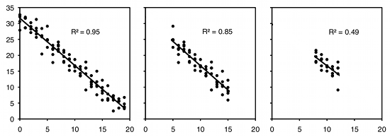
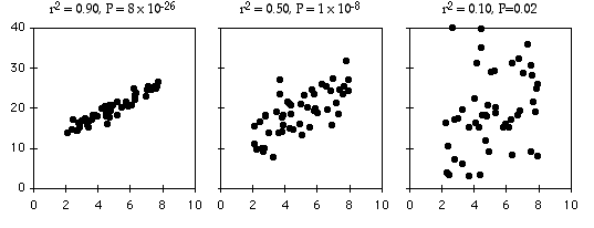
As an example of regression, let's say you've decided forensic anthropology is too disgusting, so now you're interested in the effect of air temperature on running speed in lizards. You put some lizards in a temperature chamber set to 10°C, chase them, and record how fast they run. You do the same for 10 different temperatures, ranging up to 30°C. This is a regression, because you decided which temperatures to use. You'll probably still want to calculate r2, just because high values are more impressive. But it's not a very meaningful estimate of anything about lizards. This is because the r2 depends on the values of the independent variable that you chose. For the exact same relationship between temperature and running speed, a narrower range of temperatures would give a smaller r2. Here are three graphs showing some simulated data, with the same scatter (standard deviation) of Y values at each value of X. As you can see, with a narrower range of X values, the r2 gets smaller. If you did another experiment on humidity and running speed in your lizards and got a lower r2, you couldn't say that running speed is more strongly associated with temperature than with humidity; if you had chosen a narrower range of temperatures and a broader range of humidities, humidity might have had a larger r2 than temperature.
If you try to classify every experiment as either regression or correlation, you'll quickly find that there are many experiments that don't clearly fall into one category. For example, let's say that you study air temperature and running speed in lizards. You go out to the desert every Saturday for the eight months of the year that your lizards are active, measure the air temperature, then chase lizards and measure their speed. You haven't deliberately chosen the air temperature, just taken a sample of the natural variation in air temperature, so is it a correlation? But you didn't take a sample of the entire year, just those eight months, and you didn't pick days at random, just Saturdays, so is it a regression?
If you are mainly interested in using the P value for hypothesis testing, to see whether there is a relationship between the two variables, it doesn't matter whether you call the statistical test a regression or correlation. If you are interested in comparing the strength of the relationship (r2) to the strength of other relationships, you are doing a correlation and should design your experiment so that you measure X and Y on a random sample of individuals. If you determine the X values before you do the experiment, you are doing a regression and shouldn't interpret the r2 as an estimate of something general about the population you've observed.
Correlation and causation
You have probably heard people warn you, "Correlation does not imply causation." This is a reminder that when you are sampling natural variation in two variables, there is also natural variation in a lot of possible confounding variables that could cause the association between A and B. So if you see a significant association between A and B, it doesn't necessarily mean that variation in A causes variation in B; there may be some other variable, C, that affects both of them. For example, let's say you went to an elementary school, found 100 random students, measured how long it took them to tie their shoes, and measured the length of their thumbs. I'm pretty sure you'd find a strong association between the two variables, with longer thumbs associated with shorter shoe-tying times. I'm sure you could come up with a clever, sophisticated biomechanical explanation for why having longer thumbs causes children to tie their shoes faster, complete with force vectors and moment angles and equations and 3-D modeling. However, that would be silly; your sample of 100 random students has natural variation in another variable, age, and older students have bigger thumbs and take less time to tie their shoes.
So what if you make sure all your student volunteers are the same age, and you still see a significant association between shoe-tying time and thumb length; would that correlation imply causation? No, because think of why different children have different length thumbs. Some people are genetically larger than others; could the genes that affect overall size also affect fine motor skills? Maybe. Nutrition affects size, and family economics affects nutrition; could poor children have smaller thumbs due to poor nutrition, and also have slower shoe-tying times because their parents were too overworked to teach them to tie their shoes, or because they were so poor that they didn't get their first shoes until they reached school age? Maybe. I don't know, maybe some kids spend so much time sucking their thumb that the thumb actually gets longer, and having a slimy spit-covered thumb makes it harder to grip a shoelace. But there would be multiple plausible explanations for the association between thumb length and shoe-tying time, and it would be incorrect to conclude "Longer thumbs make you tie your shoes faster."
Since it's possible to think of multiple explanations for an association between two variables, does that mean you should cynically sneer "Correlation does not imply causation!" and dismiss any correlation studies of naturally occurring variation? No. For one thing, observing a correlation between two variables suggests that there's something interesting going on, something you may want to investigate further. For example, studies have shown a correlation between eating more fresh fruits and vegetables and lower blood pressure. It's possible that the correlation is because people with more money, who can afford fresh fruits and vegetables, have less stressful lives than poor people, and it's the difference in stress that affects blood pressure; it's also possible that people who are concerned about their health eat more fruits and vegetables and exercise more, and it's the exercise that affects blood pressure. But the correlation suggests that eating fruits and vegetables may reduce blood pressure. You'd want to test this hypothesis further, by looking for the correlation in samples of people with similar socioeconomic status and levels of exercise; by statistically controlling for possible confounding variables using techniques such as multiple regression; by doing animal studies; or by giving human volunteers controlled diets with different amounts of fruits and vegetables. If your initial correlation study hadn't found an association of blood pressure with fruits and vegetables, you wouldn't have a reason to do these further studies. Correlation may not imply causation, but it tells you that something interesting is going on.
In a regression study, you set the values of the independent variable, and you control or randomize all of the possible confounding variables. For example, if you are investigating the relationship between blood pressure and fruit and vegetable consumption, you might think that it's the potassium in the fruits and vegetables that lowers blood pressure. You could investigate this by getting a bunch of volunteers of the same sex, age, and socioeconomic status. You randomly choose the potassium intake for each person, give them the appropriate pills, have them take the pills for a month, then measure their blood pressure. All of the possible confounding variables are either controlled (age, sex, income) or randomized (occupation, psychological stress, exercise, diet), so if you see an association between potassium intake and blood pressure, the only possible cause would be that potassium affects blood pressure. So if you've designed your experiment correctly, regression does imply causation.
Null hypothesis
The null hypothesis of correlation/linear regression is that the slope of the best-fit line is equal to zero; in other words, as the X variable gets larger, the associated Y variable gets neither higher nor lower.
It is also possible to test the null hypothesis that the Y value predicted by the regression equation for a given value of X is equal to some theoretical expectation; the most common would be testing the null hypothesis that the Y intercept is 0. This is rarely necessary in biological experiments, so I won't cover it here, but be aware that it is possible.
Independent vs. dependent variables
When you are testing a cause-and-effect relationship, the variable that causes the relationship is called the independent variable and you plot it on the X axis, while the effect is called the dependent variable and you plot it on the Y axis. In some experiments you set the independent variable to values that you have chosen; for example, if you're interested in the effect of temperature on calling rate of frogs, you might put frogs in temperature chambers set to 10°C, 15°C, 20°C, etc. In other cases, both variables exhibit natural variation, but any cause-and-effect relationship would be in one way; if you measure the air temperature and frog calling rate at a pond on several different nights, both the air temperature and the calling rate would display natural variation, but if there's a cause-and-effect relationship, it's temperature affecting calling rate; the rate at which frogs call does not affect the air temperature.
Sometimes it's not clear which is the independent variable and which is the dependent, even if you think there may be a cause-and-effect relationship. For example, if you are testing whether salt content in food affects blood pressure, you might measure the salt content of people's diets and their blood pressure, and treat salt content as the independent variable. But if you were testing the idea that high blood pressure causes people to crave high-salt foods, you'd make blood pressure the independent variable and salt intake the dependent variable.
Sometimes, you're not looking for a cause-and-effect relationship at all, you just want to see if two variables are related. For example, if you measure the range-of-motion of the hip and the shoulder, you're not trying to see whether more flexible hips cause more flexible shoulders, or more flexible shoulders cause more flexible hips; instead, you're just trying to see if people with more flexible hips also tend to have more flexible shoulders, presumably due to some factor (age, diet, exercise, genetics) that affects overall flexibility. In this case, it would be completely arbitrary which variable you put on the X axis and which you put on the Y axis.
Fortunately, the P value and the r2 are not affected by which variable you call the X and which you call the Y; you'll get mathematically identical values either way. The least-squares regression line does depend on which variable is the X and which is the Y; the two lines can be quite different if the r2 is low. If you're truly interested only in whether the two variables covary, and you are not trying to infer a cause-and-effect relationship, you may want to avoid using the linear regression line as decoration on your graph.
Researchers in a few fields traditionally put the independent variable on the Y axis. Oceanographers, for example, often plot depth on the Y axis (with 0 at the top) and a variable that is directly or indirectly affected by depth, such as chlorophyll concentration, on the X axis. I wouldn't recommend this unless it's a really strong tradition in your field, as it could lead to confusion about which variable you're considering the independent variable in a linear regression.
How the test works
Regression line
Linear regression finds the line that best fits the data points. There are actually a number of different definitions of "best fit," and therefore a number of different methods of linear regression that fit somewhat different lines. By far the most common is "ordinary least-squares regression"; when someone just says "least-squares regression" or "linear regression" or "regression," they mean ordinary least-squares regression.
In ordinary least-squares regression, the "best" fit is defined as the line that minimizes the squared vertical distances between the data points and the line. For a data point with an X value of X1 and a Y value of Y1, the difference between Y1 and Ŷ1 (the predicted value of Y at X1) is calculated, then squared. This squared deviate is calculated for each data point, and the sum of these squared deviates measures how well a line fits the data. The regression line is the one for which this sum of squared deviates is smallest. I'll leave out the math that is used to find the slope and intercept of the best-fit line; you're a biologist and have more important things to think about.
The equation for the regression line is usually expressed as Ŷ=a+bX, where a is the Y intercept and b is the slope. Once you know a and b, you can use this equation to predict the value of Y for a given value of X. For example, the equation for the heart rate-speed experiment is rate=63.357+3.749×speed. I could use this to predict that for a speed of 10 kph, my heart rate would be 100.8 bpm. You should do this kind of prediction within the range of X values found in the original data set (interpolation). Predicting Y values outside the range of observed values (extrapolation) is sometimes interesting, but it can easily yield ridiculous results if you go far outside the observed range of X. In the frog example below, you could mathematically predict that the inter-call interval would be about 16 seconds at −40°C. Actually, the inter-calling interval would be infinity at that temperature, because all the frogs would be frozen solid.
Sometimes you want to predict X from Y. The most common use of this is constructing a standard curve. For example, you might weigh some dry protein and dissolve it in water to make solutions containing 0, 100, 200 … 1000 µg protein per ml, add some reagents that turn color in the presence of protein, then measure the light absorbance of each solution using a spectrophotometer. Then when you have a solution with an unknown concentration of protein, you add the reagents, measure the light absorbance, and estimate the concentration of protein in the solution.
There are two common methods to estimate X from Y. One way is to do the usual regression with X as the independent variable and Y as the dependent variable; for the protein example, you'd have protein as the independent variable and absorbance as the dependent variable. You get the usual equation, Ŷ=a+bX, then rearrange it to solve for X, giving you X̂=(Y−a)/b. This is called "classical estimation."
The other method is to do linear regression with Y as the independent variable and X as the dependent variable, also known as regressing X on Y. For the protein standard curve, you would do a regression with absorbance as the X variable and protein concentration as the Y variable. You then use this regression equation to predict unknown values of X from Y. This is known as "inverse estimation."
Several simulation studies have suggested that inverse estimation gives a more accurate estimate of X than classical estimation (Krutchkoff 1967, Krutchkoff 1969, Lwin and Maritz 1982, Kannan et al. 2007), so that is what I recommend. However, some statisticians prefer classical estimation (Sokal and Rohlf 1995, pp. 491-493). If the r2 is high (the points are close to the regression line), the difference between classical estimation and inverse estimation is pretty small. When you're construction a standard curve for something like protein concentration, the r2 is usually so high that the difference between classical and inverse estimation will be trivial. But the two methods can give quite different estimates of X when the original points were scattered around the regression line. For the exercise and pulse data, with an r2 of 0.98, classical estimation predicts that to get a pulse of 100 bpm, I should run at 9.8 kph, while inverse estimation predicts a speed of 9.7 kph. The amphipod data has a much lower r2 of 0.25, so the difference between the two techniques is bigger; if I want to know what size amphipod would have 30 eggs, classical estimation predicts a size of 10.8 mg, while inverse estimation predicts a size of 7.5 mg.
Sometimes your goal in drawing a regression line is not predicting Y from X, or predicting X from Y, but instead describing the relationship between two variables. If one variable is the independent variable and the other is the dependent variable, you should use the least-squares regression line. However, if there is no cause-and-effect relationship between the two variables, the least-squares regression line is inappropriate. This is because you will get two different lines, depending on which variable you pick to be the independent variable. For example, if you want to describe the relationship between thumb length and big toe length, you would get one line if you made thumb length the independent variable, and a different line if you made big-toe length the independent variable. The choice would be completely arbitrary, as there is no reason to think that thumb length causes variation in big-toe length, or vice versa.
A number of different lines have been proposed to describe the relationship between two variables with a symmetrical relationship (where neither is the independent variable). The most common method is reduced major axis regression (also known as standard major axis regression or geometric mean regression). It gives a line that is intermediate in slope between the least-squares regression line of Y on X and the least-squares regression line of X on Y; in fact, the slope of the reduced major axis line is the geometric mean of the two least-squares regression lines.
While reduced major axis regression gives a line that is in some ways a better description of the symmetrical relationship between two variables (McArdle 2003, Smith 2009), you should keep two things in mind. One is that you shouldn't use the reduced major axis line for predicting values of X from Y, or Y from X; you should still use least-squares regression for prediction. The other thing to know is that you cannot test the null hypothesis that the slope of the reduced major axis line is zero, because it is mathematically impossible to have a reduced major axis slope that is exactly zero. Even if your graph shows a reduced major axis line, your P value is the test of the null that the least-square regression line has a slope of zero.
Coefficient of determination (r2)
The coefficient of determination, or r2, expresses the strength of the relationship between the X and Y variables. It is the proportion of the variation in the Y variable that is "explained" by the variation in the X variable. r2 can vary from 0 to 1; values near 1 mean the Y values fall almost right on the regression line, while values near 0 mean there is very little relationship between X and Y. As you can see, regressions can have a small r2 and not look like there's any relationship, yet they still might have a slope that's significantly different from zero.
To illustrate the meaning of r2, here are six pairs of X and Y values:
| X | Y | Deviate from mean | Squared deviate |
|---|---|---|---|
| 1 | 2 | 8 | 64 |
| 3 | 9 | 1 | 1 |
| 5 | 9 | 1 | 1 |
| 6 | 11 | 1 | 1 |
| 7 | 14 | 4 | 16 |
| 9 | 15 | 5 | 25 |
| sum of squares: | 108 | ||
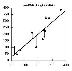
If you didn't know anything about the X value and were told to guess what a Y value was, your best guess would be the mean Y; for this example, the mean Y is 10. The squared deviates of the Y values from their mean is the total sum of squares, familiar from analysis of variance. The vertical lines on the left graph below show the deviates from the mean; the first point has a deviate of 8, so its squared deviate is 64, etc. The total sum of squares for these numbers is 64+1+1+1+16+25=108.
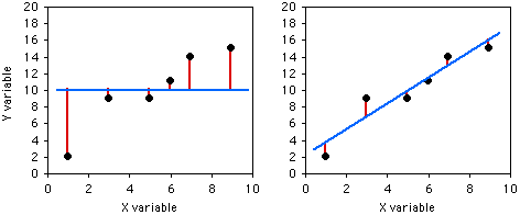
If you did know the X value and were told to guess what a Y value was, you'd calculate the regression equation and use it. The regression equation for these numbers is Ŷ=2.0286+1.5429X, so for the first X value you'd predict a Y value of 2.0286+1.5429×1=3.5715, etc. The vertical lines on the right graph above show the deviates of the actual Y values from the predicted Ŷ values. As you can see, most of the points are closer to the regression line than they are to the overall mean. Squaring these deviates and taking the sum gives us the regression sum of squares, which for these numbers is 10.8.
| X | Y | Predicted Y value | Deviate from predicted | Squared deviate |
|---|---|---|---|---|
| 1 | 2 | 3.57 | 1.57 | 2.46 |
| 3 | 9 | 6.66 | 2.34 | 5.48 |
| 5 | 9 | 9.74 | 0.74 | 0.55 |
| 6 | 11 | 11.29 | 0.29 | 0.08 |
| 7 | 14 | 12.83 | 1.17 | 1.37 |
| 9 | 15 | 15.91 | 0.91 | 0.83 |
| Regression sum of squares: | 10.8 | |||
The regression sum of squares is 10.8, which is 90% smaller than the total sum of squares (108). This difference between the two sums of squares, expressed as a fraction of the total sum of squares, is the definition of r2. In this case we would say that r2=0.90; the X variable "explains" 90% of the variation in the Y variable.
The r2 value is formally known as the "coefficient of determination," although it is usually just called r2. The square root of r2, with a negative sign if the slope is negative, is the Pearson product-moment correlation coefficient, r, or just "correlation coefficient." You can use either r or r2 to describe the strength of the association between two variables. I prefer r2, because it is used more often in my area of biology, it has a more understandable meaning (the proportional difference between total sum of squares and regression sum of squares), and it doesn't have those annoying negative values. You should become familiar with the literature in your field and use whichever measure is most common. One situation where r is more useful is if you have done linear regression/correlation for multiple sets of samples, with some having positive slopes and some having negative slopes, and you want to know whether the mean correlation coefficient is significantly different from zero; see McDonald and Dunn (2013) for an application of this idea.
Test statistic
The test statistic for a linear regression is ts=√/√. It gets larger as the degrees of freedom (n−2) get larger or the r2 gets larger. Under the null hypothesis, the test statistic is t-distributed with n−2 degrees of freedom. When reporting the results of a linear regression, most people just give the r2 and degrees of freedom, not the ts value. Anyone who really needs the ts value can calculate it from the r2 and degrees of freedom.
For the heart rate–speed data, the r2 is 0.976 and there are 9 degrees of freedom, so the ts-statistic is 19.2. It is significant (P=1.3×10⁻⁸).
Some people square ts and get an F-statistic with 1 degree of freedom in the numerator and n−2 degrees of freedom in the denominator. The resulting P value is mathematically identical to that calculated with ts.
Because the P value is a function of both the r2 and the sample size, you should not use the P value as a measure of the strength of association. If the correlation of A and B has a smaller P value than the correlation of A and C, it doesn't necessarily mean that A and B have a stronger association; it could just be that the data set for the A–B experiment was larger. If you want to compare the strength of association of different data sets, you should use r or r2.
Assumptions
Normality and homoscedasticity. Two assumptions, similar to those for anova, are that for any value of X, the Y values will be normally distributed and they will be homoscedastic. Although you will rarely have enough data to test these assumptions, they are often violated.
Fortunately, numerous simulation studies have shown that regression and correlation are quite robust to deviations from normality; this means that even if one or both of the variables are non-normal, the P value will be less than 0.05 about 5% of the time if the null hypothesis is true (Edgell and Noon 1984, and references therein). So in general, you can use linear regression/correlation without worrying about non-normality.
Sometimes you'll see a regression or correlation that looks like it may be significant due to one or two points being extreme on both the x and y axes. In this case, you may want to use Spearman's rank correlation, which reduces the influence of extreme values, or you may want to find a data transformation that makes the data look more normal. Another approach would be analyze the data without the extreme values, and report the results with or without them outlying points; your life will be easier if the results are similar with or without them.
When there is a significant regression or correlation, X values with higher mean Y values will often have higher standard deviations of Y as well. This happens because the standard deviation is often a constant proportion of the mean. For example, people who are 1.5 meters tall might have a mean weight of 50 kg and a standard deviation of 10 kg, while people who are 2 meters tall might have a mean weight of 100 kg and a standard deviation of 20 kg. When the standard deviation of Y is proportional to the mean, you can make the data be homoscedastic with a log transformation of the Y variable.
Linearity. Linear regression and correlation assume that the data fit a straight line. If you look at the data and the relationship looks curved, you can try different data transformations of the X, the Y, or both, and see which makes the relationship straight. Of course, it's best if you choose a data transformation before you analyze your data. You can choose a data transformation beforehand based on previous data you've collected, or based on the data transformation that others in your field use for your kind of data.
A data transformation will often straighten out a J-shaped curve. If your curve looks U-shaped, S-shaped, or something more complicated, a data transformation won't turn it into a straight line. In that case, you'll have to use curvilinear regression.
Independence. Linear regression and correlation assume that the data points are independent of each other, meaning that the value of one data point does not depend on the value of any other data point. The most common violation of this assumption in regression and correlation is in time series data, where some Y variable has been measured at different times. For example, biologists have counted the number of moose on Isle Royale, a large island in Lake Superior, every year. Moose live a long time, so the number of moose in one year is not independent of the number of moose in the previous year, it is highly dependent on it; if the number of moose in one year is high, the number in the next year will probably be pretty high, and if the number of moose is low one year, the number will probably be low the next year as well. This kind of non-independence, or "autocorrelation," can give you a "significant" regression or correlation much more often than 5% of the time, even when the null hypothesis of no relationship between time and Y is true. If both X and Y are time series—for example, you analyze the number of wolves and the number of moose on Isle Royale—you can also get a "significant" relationship between them much too often.
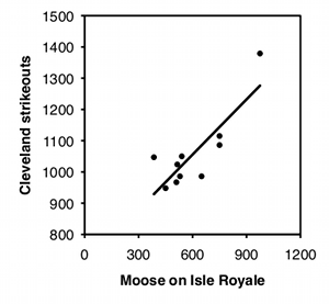
To illustrate how easy it is to fool yourself with time-series data, I tested the correlation between the number of moose on Isle Royale in the winter and the number of strikeouts thrown by major league baseball teams the following season, using data for 2004–2013. I did this separately for each baseball team, so there were 30 statistical tests. I'm pretty sure the null hypothesis is true (I can't think of anything that would affect both moose abundance in the winter and strikeouts the following summer), so with 30 baseball teams, you'd expect the P value to be less than 0.05 for 5% of the teams, or about one or two. Instead, the P value is significant for 7 teams, which means that if you were stupid enough to test the correlation of moose numbers and strikeouts by your favorite team, you'd have almost a 1-in-4 chance of convincing yourself there was a relationship between the two. Some of the correlations look pretty good: strikeout numbers by the Cleveland team and moose numbers have an r2 of 0.70 and a P value of 0.002:
There are special statistical tests for time-series data. I will not cover them here; if you need to use them, see how other people in your field have analyzed data similar to yours, then find out more about the methods they used.
Spatial autocorrelation is another source of non-independence. This occurs when you measure a variable at locations that are close enough together that nearby locations will tend to have similar values. For example, if you want to know whether the abundance of dandelions is associated with the among of phosphate in the soil, you might mark a bunch of 1 m2 squares in a field, count the number of dandelions in each quadrat, and measure the phosphate concentration in the soil of each quadrat. However, both dandelion abundance and phosphate concentration are likely to be spatially autocorrelated; if one quadrat has a lot of dandelions, its neighboring quadrats will also have a lot of dandelions, for reasons that may have nothing to do with phosphate. Similarly, soil composition changes gradually across most areas, so a quadrat with low phosphate will probably be close to other quadrats that are low in phosphate. It would be easy to find a significant correlation between dandelion abundance and phosphate concentration, even if there is no real relationship. If you need to learn about spatial autocorrelation in ecology, Dale and Fortin (2009) is a good place to start.
Another area where spatial autocorrelation is a problem is image analysis. For example, if you label one protein green and another protein red, then look at the amount of red and green protein in different parts of a cell, the high level of autocorrelation between neighboring pixels makes it very easy to find a correlation between the amount of red and green protein, even if there is no true relationship. See McDonald and Dunn (2013) for a solution to this problem.
Examples
A common observation in ecology is that species diversity decreases as you get further from the equator. To see whether this pattern could be seen on a small scale, I used data from the Audubon Society's Christmas Bird Count, in which birders try to count all the birds in a 15-mile diameter area during one winter day. I looked at the total number of species seen in each area on the Delmarva Peninsula during the 2005 count. Latitude and number of bird species are the two measurement variables; location is the hidden nominal variable.
| Location | Latitude | Number of species |
|---|---|---|
| Bombay Hook, DE | 39.217 | 128 |
| Cape Henlopen, DE | 38.8 | 137 |
| Middletown, DE | 39.467 | 108 |
| Milford, DE | 38.958 | 118 |
| Rehoboth, DE | 38.6 | 135 |
| Seaford-Nanticoke, DE | 38.583 | 94 |
| Wilmington, DE | 39.733 | 113 |
| Crisfield, MD | 38.033 | 118 |
| Denton, MD | 38.9 | 96 |
| Elkton, MD | 39.533 | 98 |
| Lower Kent County, MD | 39.133 | 121 |
| Ocean City, MD | 38.317 | 152 |
| Salisbury, MD | 38.333 | 108 |
| S. Dorchester County, MD | 38.367 | 118 |
| Cape Charles, VA | 37.2 | 157 |
| Chincoteague, VA | 37.967 | 125 |
| Wachapreague, VA | 37.667 | 114 |
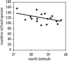
The result is r2=0.214, with 15 d.f., so the P value is 0.061. The trend is in the expected direction, but it is not quite significant. The equation of the regression line is number of species=−12.039×latitude+585.14. Even if it were significant, I don't know what you'd do with the equation; I suppose you could extrapolate and use it to predict that above the 49th parallel, there would be fewer than zero bird species.
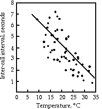

Gayou (1984) measured the intervals between male mating calls in the gray tree frog, Hyla versicolor, at different temperatures. The regression line is interval=−0.205×temperature+8.36, and it is highly significant (r2=0.29, 45 d.f., P=9×10⁻⁵). You could rearrange the equation, temperature=(interval−8.36)/(−0.205), measure the interval between frog mating calls, and estimate the air temperature. Or you could buy a thermometer.
Goheen et al. (2003) captured 14 female northern grasshopper mice (Onchomys leucogaster) in north-central Kansas, measured the body length, and counted the number of offspring. There are two measurement variables, body length and number of offspring, and the authors were interested in whether larger body size causes an increase in the number of offspring, so they did a linear regression. The results are significant: r2=0.46, 12 d.f., P=0.008. The equation of the regression line is offspring=0.108×length−7.88.
Graphing the results
In a spreadsheet, you show the results of a regression on a scatter graph, with the independent variable on the X axis. To add the regression line to the graph, finish making the graph, then select the graph and go to the Chart menu. Choose "Add Trendline" and choose the straight line. If you want to show the regression line extending beyond the observed range of X values, choose "Options" and adjust the "Forecast" numbers until you get the line you want.
Similar tests
Sometimes it is not clear whether an experiment includes one measurement variable and two nominal variables, and should be analyzed with a two-way anova or paired t–test, or includes two measurement variables and one hidden nominal variable, and should be analyzed with correlation and regression. In that case, your choice of test is determined by the biological question you're interested in. For example, let's say you've measured the range of motion of the right shoulder and left shoulder of a bunch of right-handed people. If your question is "Is there an association between the range of motion of people's right and left shoulders—do people with more flexible right shoulders also tend to have more flexible left shoulders?", you'd treat "right shoulder range-of-motion" and "left shoulder range-of-motion" as two different measurement variables, and individual as one hidden nominal variable, and analyze with correlation and regression. If your question is "Is the right shoulder more flexible than the left shoulder?", you'd treat "range of motion" as one measurement variable, "right vs. left" as one nominal variable, individual as one nominal variable, and you'd analyze with two-way anova or a paired t–test.
If the dependent variable is a percentage, such as percentage of people who have heart attacks on different doses of a drug, it's really a nominal variable, not a measurement. Each individual observation is a value of the nominal variable ("heart attack" or "no heart attack"); the percentage is not really a single observation, it's a way of summarizing a bunch of observations. One approach for percentage data is to arcsine transform the percentages and analyze with correlation and linear regression. You'll see this in the literature, and it's not horrible, but it's better to analyze using logistic regression.
If the relationship between the two measurement variables is best described by a curved line, not a straight one, one possibility is to try different transformations on one or both of the variables. The other option is to use curvilinear regression.
If one or both of your variables are ranked variables, not measurement, you should use Spearman rank correlation. Some people recommend Spearman rank correlation when the assumptions of linear regression/correlation (normality and homoscedasticity) are not met, but I'm not aware of any research demonstrating that Spearman is really better in this situation.
To compare the slopes or intercepts of two or more regression lines to each other, use ancova.
If you have more than two measurement variables, use multiple regression.
How to do the test
Spreadsheet
I have put together a spreadsheet to do linear regression and correlation on up to 1000 pairs of observations. It provides the following:
- The regression coefficient (the slope of the regression line).
- The Y intercept. With the slope and the intercept, you have the equation for the regression line: Ŷ=a+bX, where a is the y intercept and b is the slope.
- The r2 value.
- The degrees of freedom. There are n−2 degrees of freedom in a regression, where n is the number of observations.
- The P value. This gives you the probability of finding a slope that is as large or larger than the observed slope, under the null hypothesis that the true slope is 0.
- A Y estimator and an X estimator. This enables you to enter a value of X and find the corresponding value of Y on the best-fit line, or vice-versa. This would be useful for constructing standard curves, such as used in protein assays for example.
Web pages
Web pages that will perform linear regression are here, here, and here. They all require you to enter each number individually, and thus are inconvenient for large data sets. This web page does linear regression and lets you paste in a set of numbers, which is more convenient for large data sets.
R
Salvatore Mangiafico's R Companion has a sample R program for correlation and linear regression.
SAS
You can use either PROC GLM or PROC REG for a simple linear regression; since PROC REG is also used for multiple regression, you might as well learn to use it. In the MODEL statement, you give the Y variable first, then the X variable after the equals sign. Here's an example using the bird data from above.
DATA birds;
   INPUT town $ state $ latitude species;
   DATALINES;
Bombay_Hook          DE     39.217     128
Cape_Henlopen        DE     38.800     137
Middletown           DE     39.467     108
Milford              DE     38.958     118
Rehoboth             DE     38.600     135
Seaford-Nanticoke    DE     38.583      94
Wilmington           DE     39.733     113
Crisfield            MD     38.033     118
Denton               MD     38.900      96
Elkton               MD     39.533      98
Lower_Kent_County    MD     39.133     121
Ocean_City           MD     38.317     152
Salisbury            MD     38.333     108
S_Dorchester_County  MD     38.367     118
Cape_Charles         VA     37.200     157
Chincoteague         VA     37.967     125
Wachapreague         VA     37.667     114
;
PROC REG DATA=birds;
   MODEL species=latitude;
   RUN;
The output includes an analysis of variance table. Don't be alarmed by this; if you dig down into the math, regression is just another variety of anova. Below the anova table are the r2, slope, intercept, and P value:
Root MSE             16.37357    R-Square     0.2143 r2
Dependent Mean      120.00000    Adj R-Sq     0.1619
Coeff Var            13.64464

                        Parameter Estimates

               Parameter   Standard
Variable   DF   Estimate      Error  t Value  Pr > |t|

               intercept
Intercept   1  585.14462  230.02416     2.54    0.0225
latitude    1  -12.03922    5.95277    -2.02    0.0613 P value
                slope
These results indicate an r2 of 0.21, intercept of 585.1, a slope of −12.04, and a P value of 0.061.
Power analysis
The G*Power program will calculate the sample size needed for a regression/correlation. The effect size is the absolute value of the correlation coefficient r; if you have r2, take the positive square root of it. Choose "t tests" from the "Test family" menu and "Correlation: Point biserial model" from the "Statistical test" menu. Enter the r value you hope to see, your alpha (usually 0.05) and your power (usually 0.80 or 0.90).
For example, let's say you want to look for a relationship between calling rate and temperature in the barking tree frog, Hyla gratiosa. Gayou (1984) found an r2 of 0.29 in another frog species, H. versicolor, so you decide you want to be able to detect an r2 of 0.25 or more. The square root of 0.25 is 0.5, so you enter 0.5 for "Effect size", 0.05 for alpha, and 0.8 for power. The result is 26 observations of temperature and frog calling rate.
It's important to note that the distribution of X variables, in this case air temperatures, should be the same for the proposed study as for the pilot study the sample size calculation was based on. Gayou (1984) measured frog calling rate at temperatures that were fairly evenly distributed from 10°C to 34°C. If you looked at a narrower range of temperatures, you'd need a lot more observations to detect the same kind of relationship.
References
Dale, M.R.T., and M.-J. Fortin. 2009. Spatial autocorrelation and statistical tests: some solutions. Journal of Agricultural, Biological and Environmental Statistics 14: 188-206.
Edgell, S.E., and S.M. Noon. 1984. Effect of violation of normality on the t–test of the correlation coefficient. Psychological Bulletin 95: 576-583.
Gayou, D.C. 1984. Effects of temperature on the mating call of Hyla versicolor. Copeia 1984: 733-738.
Goheen, J.R., G.A. Kaufman, and D.W. Kaufman. 2003. Effect of body size on reproductive characteristics of the northern grasshopper mouse in north-central Kansas. Southwestern Naturalist 48: 427-431.
Kannan, N., J.P. Keating, and R.L. Mason. 2007. A comparison of classical and inverse estimators in the calibration problem. Communications in Statistics: Theory and Methods 36: 83-95.
Krutchkoff, R.G. 1967. Classical and inverse regression methods of calibration. Technometrics 9: 425-439.
Krutchkoff, R.G. 1969. Classical and inverse regression methods of calibration in extrapolation. Technometrics 11: 605-608.
Lwin, T., and J.S. Maritz. 1982. An analysis of the linear-calibration controversy from the perspective of compound estimation. Technometrics 24: 235-242.
McCardle, B.H. 2003. Lines, models, and errors: Regression in the field. Limnology and Oceanography 48: 1363-1366.
McDonald, J.H. 1989. Selection component analysis of the Mpi locus in the amphipod Platorchestia platensis. Heredity 62: 243-249.
McDonald, J.H., and K.W. Dunn. 2013. Statistical tests for measures of colocalization in biological microscopy. Journal of Microscopy 252: 295-302.
Smith, R.J. 2009. Use and misuse of the reduced major axis for line-fitting. American Journal of Physical Anthropology 140: 476-486.
Sokal, R.R., and F.J. Rohlf. 1995. Biometry. W.H. Freeman, New York.
⇐ Previous topic|Next topic
⇒
Table of Contents
This page was last revised July 20, 2015. Its address is http://www.biostathandbook.com/linearregression.html. It may be cited as:
McDonald, J.H. 2014. Handbook of Biological Statistics (3rd ed.). Sparky House Publishing, Baltimore, Maryland. This web page contains the content of pages 190-208 in the printed version.
©2014 by John H. McDonald. You can probably do what you want with this content; see the permissions page for details.