⇐ Previous topic|Next topic ⇒
Table of Contents
Presenting data in tables
Summary
Here are some tips for presenting scientific information in tables.
Graph or table?
For a presentation, you should almost always use a graph, rather than a table, to present your data. It's easier to compare numbers to each other if they're represented by bars or symbols on a graph, rather than numbers. Here's data from the one-way anova page presented in both a graph and a table:
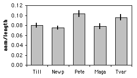
| Location | Mean AAM/ length | SE | N |
|---|---|---|---|
| Tillamook | 0.080 | 0.0038 | 10 |
| Newport | 0.075 | 0.0030 | 8 |
| Petersburg | 0.103 | 0.0061 | 7 |
| Magadan | 0.078 | 0.0046 | 8 |
| Tvarminne | 0.096 | 0.0053 | 6 |
It's a lot easier to look at the graph and quickly see that the AAM/length ratio is highest at Petersburg and Tvarminne, while the other three locations are lower and about the same as each other. If you put this table in a presentation, you would have to point your laser frantically at one of the 15 numbers and say, "Here! Look at this number!" as your audience's attention slowly drifted away from your science and towards the refreshments table. "Would it be piggish to take a couple of cookies on the way out of the seminar, to eat later?" they'd be thinking. "Mmmmm, cookies...."
In a publication, the choice between a graph and a table is trickier. A graph is still easier to read and understand, but a table provides more detail. Most of your readers will probably be happy with a graph, but a few people who are deeply interested in your results may want more detail than you can show in a graph. If anyone is going to do a meta-analysis of your data, for example, they'll want means, sample sizes, and some measure of variation (standard error, standard deviation, or confidence limits). If you've done a bunch of statistical tests and someone wants to reanalyze your data using a correction for multiple comparisons, they'll need the exact P values, not just stars on a graph indicating significance. Someone who is planning a similar experiment to yours who is doing power analysis will need some measure of variation, as well.
Editors generally won't let you show a graph with the exact same information that you're also presenting in a table. What you can do for many journals, however, is put graphs in the main body of the paper, then put tables as supplemental material. Because these supplemental tables are online-only, you can put as much detail in them as you want; you could even have the individual measurements, not just means, if you thought it might be useful to someone.
Making a good table
Whatever word processor you're using probably has the ability to make good tables. Here are some tips:
- Each column should have a heading. It should include the units, if applicable.
- Don't separate columns with vertical lines. In the olden days of lead type, it was difficult for printers to make good-looking vertical lines; it would be easy now, but most journals still prohibit them.
- When you have a column of numbers, make sure the decimal points are aligned vertically with each other.
- Use a reasonable number of digits. For nominal variables summarized as proportions, use two digits for n less than 101, three digits for n from 101 to 1000, etc. This way, someone can use the proportion and the n and calculate your original numbers. For example, if n is 143 and you give the proportion as 0.22, it could be 31/143 or 32/143; reporting it as 0.217 lets anyone who's interested calculate that it was 31/143. For measurement variables, you should usually report the mean using one more digit than the individual measurement has; for example, if you've measured hip extension to the nearest degree, report the mean to the nearest tenth of a degree. The standard error or other measure of variation should have two or three digits. P values are usually reported with two digits (P=0.44, P=0.032, P=2.7×10⁻⁵, etc.).
- Don't use excessive numbers of horizontal lines. You'll want horizontal lines at the top and bottom of the table, and a line separating the heading from the main body, but that's probably about it. The exception is when you have multiple lines that should be grouped together. If the table of AAM/length ratios above had separate numbers for male and female mussels at each location, it might be acceptable to separate the locations with horizontal lines.
- Table formats sometimes don't translate well from one computer program to another; if you prepare a beautiful table using a Brand X word processor, then save it in Microsoft Word format or as a pdf to send to your collaborators or submit to a journal, it may not look so beautiful. So don't wait until the last minute; try out any format conversions you'll need, well before your deadline.
⇐ Previous topic|Next topic ⇒
Table of Contents
This page was last revised December 4, 2014. Its address is http://www.biostathandbook.com/table.html. It may be cited as:
McDonald, J.H. 2014. Handbook of Biological Statistics (3rd ed.). Sparky House Publishing, Baltimore, Maryland. This web page contains the content of pages 283-284 in the printed version.
©2014 by John H. McDonald. You can probably do what you want with this content; see the permissions page for details.